Arrow Button Animation Jun 20
Interesting button design and animation, with a hidden arrow that appears on hover.
Created by Ask Phill
About this component
I came across this button not too long ago, and quite liked the simple effect. It’s subtle, but gives a nice dynamic effect to an otherwise plain, flat button.
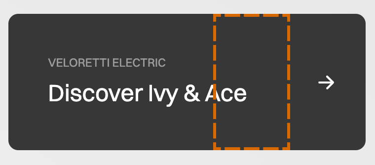
This specific button is used as the main CTA on the home page of a direct-to-consumer electric bike brand.
How to build it
This is a relatively simple effect, and at its core it's simply a hidden div moved into view on hover. To learn how to build it, follow the steps below, or jump straight to the CodeSandBox to see the final code.
Three steps
There are a three main steps to achieve this effect:
- Position the two arrows on top of each other
- Hide the top arrow initially by positioning it underneath the text container
- Animating the hidden arrow to move right on hover
This is our starting HTML setup:
<div class="button">
  <div class="textContainer">
    <p class="subText">VELORETTI ELECTRIC</p>
    <p class="mainText">Discover Ivy & Ace</p>
  </div>
  <div class="arrowContainer">
    <div class="hiddenArrow">
      <ArrowSVG /> /* Full SVG in CodeSandBox */
    </div>
    <div class="arrow">
      <ArrowSVG /> /* Full SVG in CodeSandBox */
    </div>
  </div>
</div>
Note: I'll only highlight the CSS needed for the animation itself. For the styling of the button, check the complete code at the end.
Step 1: Positioning two arrows on top of each other
To position the two arrows on top of each other, give the first arrow position: absolute. This takes it out of the layout flow. Absolutely positioned elements are located based on their first positioned ancestor. If you have no positioned elements, that means it will be positioned based on the :root (html) element, so coordinate 0:0 in the left top corner.
But we want the two arrows to be on top of each other, so we give their container arrowContainer the property position:relative. This now puts the first arrow in the exact same position it would’ve been without position absolute. But because absolute takes it out of the layout flow, the two arrows are in exactly the same position!
.arrowContainer {
  position: relative;
  display: flex;
  justify-content: center;
  align-items: center;
}
.hiddenArrow {
  position: absolute;
}
You can see this principle in effect in the example below. Try toggling the position: absolute on and off to see how the two items move on top of each other. Use your browser dev tools to inspect and see they're indeed overlapping.
In this case Item One moves on top of Item Two, but why not the other way around? This is not because Item One comes first in the DOM tree, but because it is the one that receives the position: absolute property. By default, any positioned element will always appear on top of any non-positioned element.
Tip: Another easy way to position items on top of each other is to make a container div a 1 cell grid, and force all child elements to be positioned on row 1 and column 1.
Step 2: Hiding the animated arrow
Because the animated arrow is absolutely positioned we can easily move it to the left without interfering with any other layout elements. By giving it left: -100px we can move it behind the text container.
.arrowContainer {
  position: relative;
  display: flex;
  justify-content: center;
  align-items: center;
}
.hiddenArrow {
  position: absolute;
  left: -100px;
}
Make sure the text container is positioned above the hidden arrow div with zIndex: 2 and also give it a background-color to obscure the hidden arrow from view.
.textContainer {
  z-index: 2;
  background-color: #373737; /* To hide the arrow button */
}
Step 3: Animation
Add a hover to the entire button, and make it move the hidden arrow back to its initial position on top of the other arrow, by giving it left: 0. This brings it back to its 'natural' position, which is exactly on top of the other arrow div.
.button:hover .hiddenArrow {
  left: 0;
}
To make this animation smooth, add a transition to the hidden arrow. I've used the nicely tuned cubic-bezier used by Veloretti.
Also add a semi-transparent background-color to make it seem like the two arrows are blending together.
.hiddenArrow {
  transition: 0.4s cubic-bezier(0.77, 0, 0.175, 1);
  background-color: rgba(0, 0, 0, 0.3);
}
To see the difference these two properties make, try toggling them on and off in the example below.
Transition - Cubic Bezier
Background Color with Opacity
Conclusion and CodeSandBox
So, once you’ve got the two arrows positioned correctly, it’s a very simple hover effect where you change the left: -100 property to left:0.
But for every simple effect there’s an implementation that works technically, and there's a polished implementation by someone who actually pays attention to detail, which is what Veloretti have done here.
To start, they’re not using a standard ease-in effect, but a nicely tuned Cubic Bezier for smooth motion. And they’ve added opacity: 0.3 to the background of the animated arrow, which makes it looks like the two arrows are merging, rather than the hidden arrow just going on top of the other one. Try changing that opacity back to 1 and you’ll see how much more boring or standard the animation becomes.
Sometimes it’s small touches like these that can really make or break an animation or design.
If you have questions or feedback, let me know on Twitter.