Footer Reveal Jun 19
Revealing a full-screen footer when you scroll all the way down to it, built with just CSS.
Created by Thomas Boyer Gibaud
About this component
The content area basically functions like a curtain that opens the stage for the footer. I like this effect because it brings extra attention to the footer, something which is usually ignored by most users.
The example above by Thomas Boyer Gibaud increases this effect by using a high contrast black footer compared to the light main content, and using a large font with a call to action. Together with the reveal animation, this makes it much more likely someone will actually click the email than if it were a small text on an ordinary footer.
How to build it
This reveal effect can be built with just CSS, and in surprisingly few lines as well.
These days there’s a lot of hype around page layout animations that are being done with libraries like Framer Motion, or even by rendering the entire page on a canvas and animating it with WebGL. So it’s nice to see that some effects can be achieved with much simpler means.
This is the main content, keep on scrolling down ↓
There’s three key steps to creating this effect:
- Make the content div at least
100vhand give it abackground-color - Give the content div a
z-indexandpositionto make it always be in front of the footer - Make the footer
position: stickyat the bottom
This is is our starting HTML structure:
<body>
  <div class="content">
    <h1>This is the main content, keep on scrolling down ↓</h1>
  </div>
  <footer>
    <h2>This is a call to action — <span>Email me</span></h2>
    <p>Bottom of the footer</p>
  </footer>
</body>
Step 1: Background-color and size
The first step is to make sure the footer isn’t visible initially. Adding a solid background-color takes the footer out of view, if it's behind the content.
Also, add min-height: 100vh to the content div, to ensure it always covers the entire footer. There might be some rare situations where the items inside the actual content are not long enough to cover the entire viewport (and therefore show some part of the footer).
.content {
  min-height: 100vh;
  background-color: #fcfcf1; /* Needed to obscure the footer behind it */
}
Step 2: Positioning
Secondly, we need to make sure the content is on top of the footer. Without adding a z-index, the footer would be above the content, because elements that occur later in the DOM will by default show above earlier ones.
.content {
  min-height: 100vh;
  background-color: #fcfcf1;
  position: relative; /* Needed to make z-index work */
  z-index: 1; /* Make sure the content is on top of the footer */
}
The reason for having to add position:relative is that z-index only applies to positioned elements. By using relative (as opposed to for example absolute or fixed), we give the element a position without actually affecting its layout (as long as we don't set any values for top, bottom, left, or right).
Try toggling the position from relative to initial in the example below. Notice how the footer is now on top of the content. This is because without the z-index taking effect, the footer is later in the DOM, and therefore shows above the content.
This is the main content, keep on scrolling down ↓
Step 3: Sticky footer
Finally, add position:sticky and bottom:0 to the footer to complete the effect. Also, make sure it takes up the full height of the page by adding height: 100vh.
footer {
  height: 100vh;
  background-color: black;
  color: white;
  position: sticky;
  bottom: 0;
  left: 0;
}
The key to understanding how this works is knowing that when you use position sticky, it does not actually take the element out of the overall layout.
So it still uses the height of the footer to calculate the height of the entire container. That’s why it scrolls into view when you scroll pas the main content div. Try changing position:sticky to position: fixed and you’ll see that the viewport is now just limited to the content div.
The illustration below shows how the container (the <body> element in our case) height is affected by the different position values of the <footer> element.
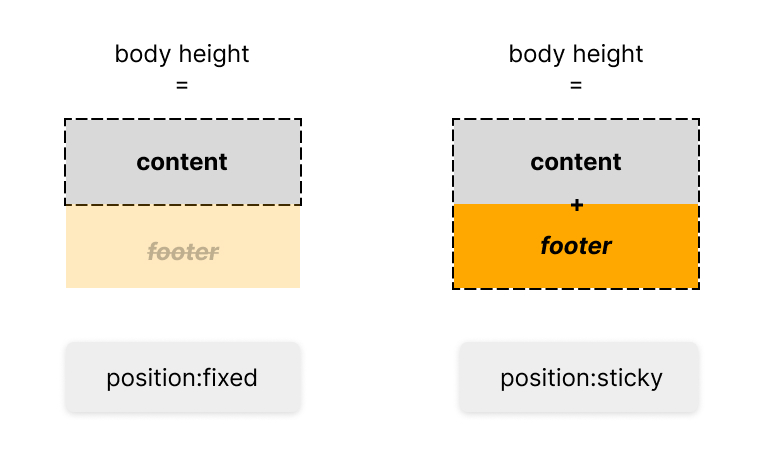
The footer div is still behind the main content div when using position:fixed (try setting it to opacity: 0.5 to see this), but you can’t scroll down anymore. That is because fixed elements are taken out of the layout flow, whereas sticky elements aren’t.
The container is then simply the same size as the content, meaning there is no more content to scroll down to.
Interactive illustration
To help get a better feeling for position:sticky in our footer example, play around with the animation below.
- The orange dashed line represents the viewport (so whatever you can see on your screen)
- The blue line represents the size of the entire container (the
<body>element in our case)
Content
Footer
As you can see, we are not scrolling towards the footer, but away from the content! The footer was in the viewport the entire time, it was just hidden behind the content.
Tip: It's not necessary to have the footer be the
100vhtall. You can also make it smaller to create the same (but slightly less dramatic) effect. For example, here on koro.dev we're using the exact same reveal effect, just with a smaller footer.
CodeSandBox
You can see the full code in the CodeSandBox below.